
Last night I spoke at Brighton Social Media, looking at ‘How is the ski industry optimising for mobile?’
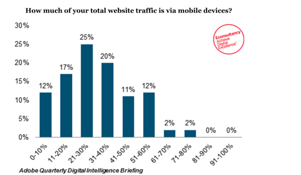
My presentation, which is available on Slideshare, and has been embedded below, took a look at the rapid increase in smartphone use in the UK, and its implications for businesses (as outlined in a previous blog post).
The ski industry has been a slow adopter
This study is not intended to be definitive. The key point I wanted to get across is that the ski industry, like the travel industry in general, has been slow to adapt.
Yes, a ski holiday is a relatively complicated product. It is not likely that a user will book a ski holiday via their smartphone.

‘You never get a second chance to make a first impression’
But a user is very likely to start the research for a holiday on their mobile, and if an operator’s website is not optimised for mobile, they may permanently lose the chance to make a sale.
‘You never get a second chance to make a first impression’: there’s a reason why that adage has lasted the years and it’s as true online as it is offline.

Which UK ski company delivers the best mobile experience?
We used Google PageSpeed Insights and Android on a Samsung GT-I8190N to test ten websites.
Please note that any website may look different on different devices and this study is not intended to be definitive.
The full results are detailed in the Powerpoint at the bottom of this page, but the three companies that stood out were easy to identify. They were:
1. Inghams
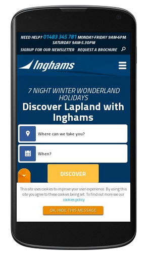
Rated with a 98% useability score by Google, we loved the design of the welcome page. The ‘Discover’ intro (this is a slider with different regions) ties in with the call to action button. It’s clear what you need to do. The Where and When fields auto-complete saving you time. Going further into the site, the navigation is consistent and easy to use.
2. Ski Beat

This was slow to load due to the image slider at the top. This takes up too much of the available screen and reduces the effectiveness of a mobile-specific site. There was also no obvious call to action. However, once into the site, it was easy to navigate with large ‘finger friendly’ buttons.
3. Le Ski
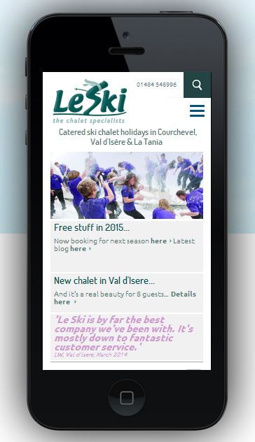
Le Ski also had a nicely designed mobile site, but lacked a call to action on the landing page. However, once into the site it was again clear, user friendly and easy to use.
The other sites we looked at were not as impressive…
1 comment
How SkiClub could beat Inghams - Website Review » Snowbistro.com says:
Jul 25, 2014
[…] at SkiPedia recently compared Inghams, Ski Beat and Le Ski in terms of the best ski industry mobile experience and suggested that other sites looked at were not as impressive. The SkiClub site only scores […]